Mark Hicks
Business Analyst | Data Analyst
Data-Driven Small Business Owner Turned Analyst
💻 Excel, Tableau, SQL
Scouting ⛵️ Sailing 🛶 Canoeing 🎾 Tennis
📍 Ozark, Missouri
Technical Skills

+ SQL+ Tableau+ Excel+ PowerBI
+ Project Management+ Product Development+ Course Creation+ Documentation
Projects
📦 E-Commerce Shipping Analysis
Power BI | Actionable Data Analysis+ Real-world retail order data
+ Using only Power BI for analysis and data visualization
+ Provided actionable recommendations to reduce late shipment risk of $16.2 million in orders
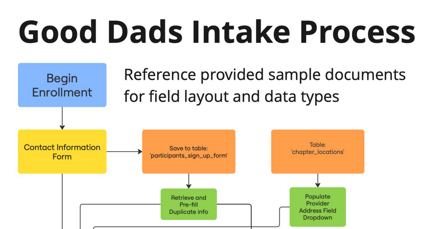
🔀 Visual Workflow Design
Miro | Visual Workspace+ Created from Stakeholder Requirements
+ Using Miro as a collaborative design tool
+ Used to verify Stakeholder Expectations and as a Developer Resource
🧱 LEGO Set Explorer
Power BI | Data Exploration Tool+ Actual product data
+ Using Power BI as a Product Explorer
+ Provided my son with dozens of hours of LEGO search fun!
🏥 Hospital Operations Analysis
SQL | Exploratory Data Analysis+ Real-world patient encounter data
+ Using only mySQL for analysis and data visualization
+ Utilized CTEs, JOIN, UNION & CAST
🏫 Evaluating School Performance
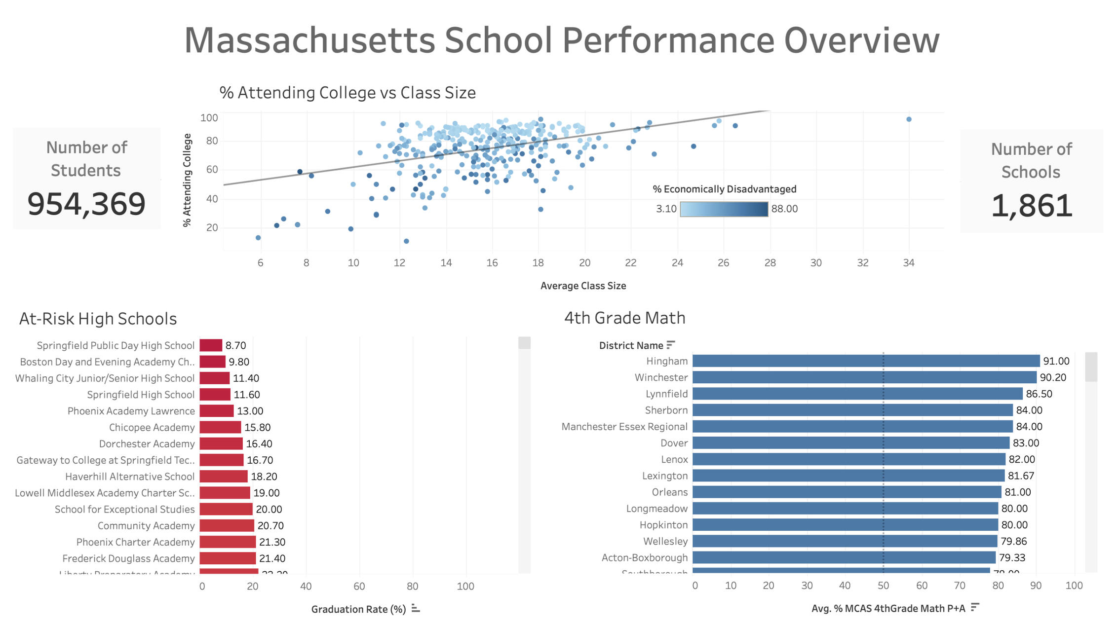
Tableau | Data Visualization+ Created dashboard evaluating 1,800 different schools' performance across 100's of features
+ Used Scatter Plots, KPI's, Bar Plots, & Area charts to show performance differences
+ Presented dashboard to stakeholders via recorded video
🍷 Food Delivery Marketing Analysis
Excel | Exploratory Analysis+ Real-world marketing data
+ Using only Excel for analysis and data visualization
+ Utilized VLOOKUPS, Pivot Tables, Scatter Plots & Bar Charts

Price Outweighs Convenience For Customers With Kids
I can’t bring myself to pay DoorDash to deliver food.With a kid at home, our schedule gets busier and busier each year. We seem like the ideal customer for a service that offers the convenience of having a meal delivered directly to our door.It’s just not convenient enough to get me to pay the fees.And I can’t debate the value. Convenience should, and does, cost extra. The drivers and developers need to be paid.So I’m left asking… How many people are actually using this service?The answer, it turns out, is a lot. DoorDash delivered 635 million orders in the second quarter of 2024.I wondered...What are these people like? Are they wealthy? Do they have kids?So I went in search of some data.I wasn’t able to find anything from DoorDash, but I did find a sample dataset from a similar delivery service in Brazil called iFood. You can find it here:iFood Data Business Analyst TestAs I dug in and explored, I learned the dataset included just over two thousand customer records and was focused on response rates to a series of ad campaigns. But it also included details about income, buying patterns, and a breakdown of whether each customer had kids.Here’s a preview of what I found:- Higher income customers are more likely to spend on delivery, but not in the highest income group.
- Middle income households make up the largest customer segment, but spend less on average.
- Households with children spend less in every category, with one surprising exception. 👀
Basic Demographics
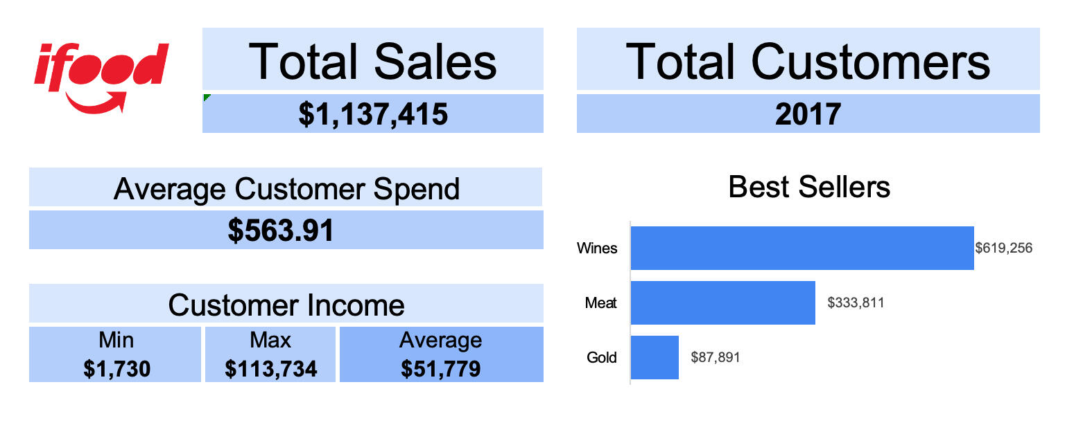
After removing some duplicates and cleaning up the data a little bit, I spent some time getting to know the basic demographics of the customers described by the data.
How Income Affects Spending
Now I wanted to find out if higher earners really were more likely to be customers.
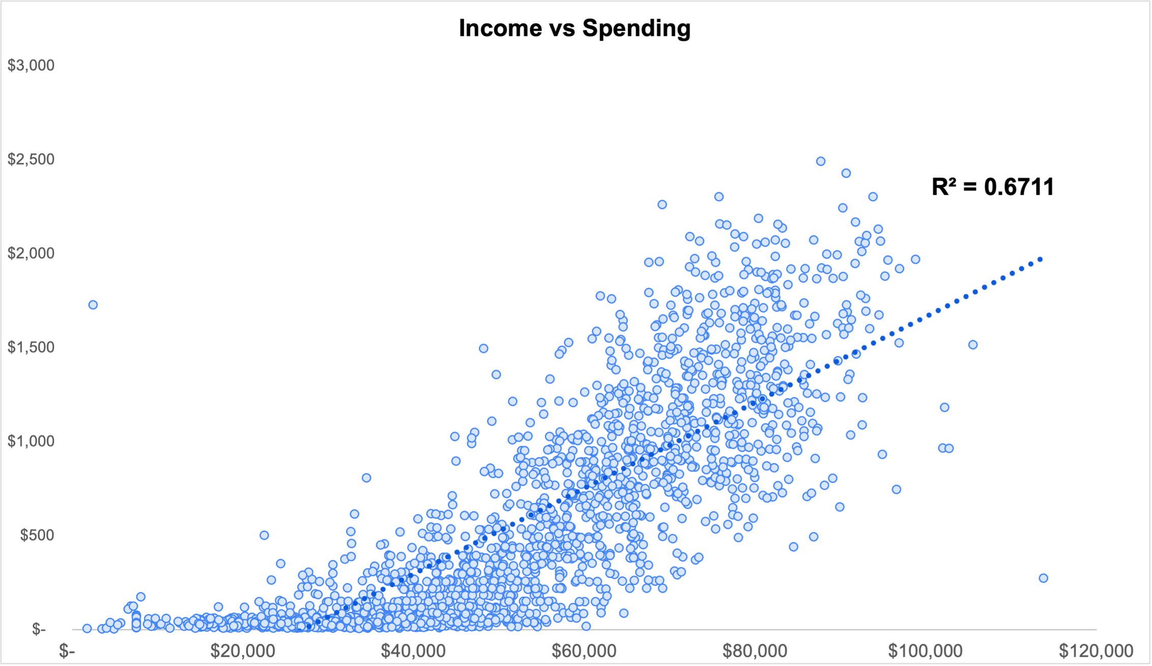
With an R-squared value of .67, this chart shows a strong correlation between the income level of the customer and the amount they spend.It also highlights to two big outliers.On the left, there is a data point that suggests a customer who earns less than $2500 per year spent nearly 70% of their income on food delivery. This doesn't seem all that likely, so I decided to remove that record from the dataset.The second outlier is on the bottom right. It shows a household with a very high income that spent very little. This isn't in line with the average behavior, but it’s certainly possible. They could have been dissatisfied with the service. Or maybe they just joined. In any case, I decided not to exclude it from the dataset.And then I noticed there were very few customers above an income level of $100,000, and ALL their spending was below average.I decided to divide the income levels into segments to see if I could learn more about each group.
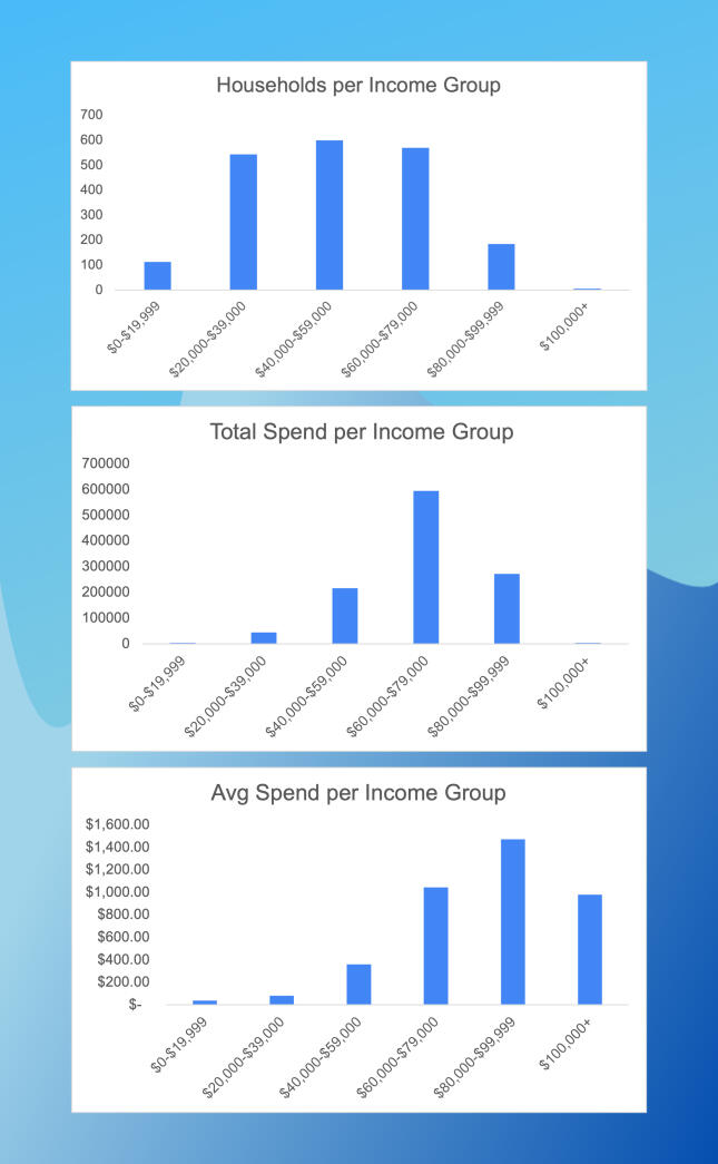
The first graph let me see that most of the customers come from one of the middle three income groups. It also indicates a steep drop in customer count with incomes above $80,000 and confirms there are very few iFood customers earning more than $100,000 per year.The second graph shows the upper-middle income group accounts for the largest share of total spending with iFood.The final graph is interesting because we can see the second highest income group spends more on average than any other.These graphs suggest that iFood should be targeting households with an income between $80,000 and $100,000 when they acquire new customers.But why does the customer base drop off so steeply after house hold income reaches $80,000? Are they looking for something else? Is there an opportunity to offer a higher-end brand to attract more customers in these higher income groups?
How Children Affect Household Spending
With a better understanding of how income affected spending, I decided to look more closely at how households with children spent differently than those without.
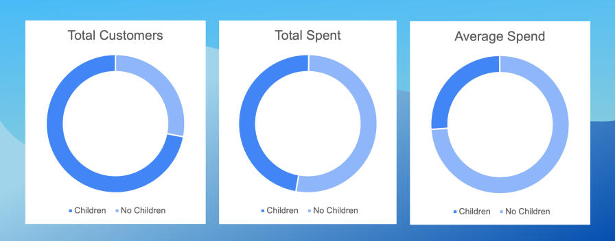
Together, these three charts show that even though the majority of their customers have children at home, they account for less than half of iFoods revenue. And customers without children spend, on average, nearly 3 times more than customers with kids.This would suggest that iFood should work harder to acquire and serve customers without children. But does this hold up over all the income groups?Since there were only 5 households with an income above $100,000, and only one of them had children, I decided to drop them from the charts as I continued my analysis.
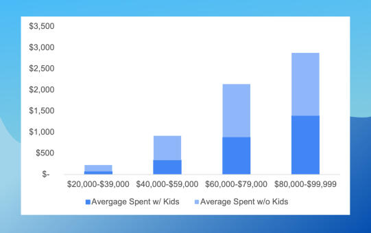
From this chart we can conclude that, in our preferred household income group ($80,000 - $100,000), the average spending is not affected by whether or not they have children.So iFood doesn't need to go to the trouble to search for customers in this group without kids.
How Households With Children Spend
We know that households with children spend less, but they’re still spending a significant amount.What are they buying?
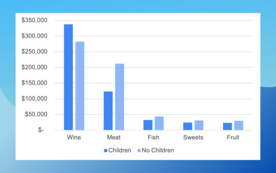
It’s Wine!
Households with children spend less in every category except wine.So, customers with children will pay for convenience in certain categories. There could be an opportunity for iFood to convince them to spend more in other categories.And what does this mean for the customers without children?Are they merely going out to drink their wine? Or should iFood examine the wines they’re offering to see if the customers with higher incomes have different preferences?
Conclusion
I learned there are plenty of people just like me spending money on food delivery. I also learned that having a child at home makes me less likely to use the service, unless I can find a way to make a little more money at work.

Does High School Class Size Affect College Attendance Rates?
Yes!
But not in the way you might think.Please read on if you'd like see the full write up for this project.Or you can watch the video walkthrough of the dashboard here.
Unpacking School Performance Data: Insights from Massachusetts Public Schools
The three biggest stakeholders in any public education system are the Students, the Teachers, and the Community who funds the schools. And one of the biggest questions the School Administration has to answers is “How do we allocate funds to the get the best outcomes for our students while supporting the needs of our teachers and staying within our budget?”.Recently, I had the chance to explore this question through a project analyzing public school performance data in Massachusetts. Armed with Tableau and a curiosity to make a difference, I immersed myself in understanding how data can guide educational priorities.
This project was motivated by my interest in education and the pressing need for effective solutions to improve school performance. With nearly 1 million students across more than 1800 schools in Massachusetts, the data provided a unique opportunity to explore questions central to educational spending.- Is hiring more teachers the best way to enhance school performance?
- Would it be better to offer more training to existing teachers?
- Which schools would require the most support?By analyzing this data, I aimed to help the Massachusetts Commissioner of Public Schools set spending priorities with clarity and purpose.
In this article, I’ll share a surprising link between class sizes and graduation rates. I’ll also identify which schools are most in need of support and which schools may be best prepared to enable positive change. My hope is that these insights can offer valuable information for stakeholders in the education sector.
I utilized a comprehensive dataset sourced from Kaggle, which contains demographic and academic performance information from nearly 1 million students in Massachusetts. It was well-structured and aggregated by both school and grade level, making it perfect for my analysis of spending priorities. This means any insights I gather can potentially impact real decisions affecting thousands of students.
My Analysis Process: Experimenting with Tableau
Using Tableau, I performed a detailed analysis of the data. I started by cleaning the dataset to ensure everything was accurate and ready for visualization. ,Let’s take a look at some visuals that represent the key findings from my analysis:

This scatter plot highlights a surprising trend: as class sizes increase, the likelihood of students attending college also rises. This correlation challenges common assumptions about the impact of class size on student success and suggests that other factors may also be at play.After looking a some of the other data available, I discovered a tendency for schools with a higher percentage of “Economically Challenged” students to produce fewer college students.
Identifying At-Risk High Schools
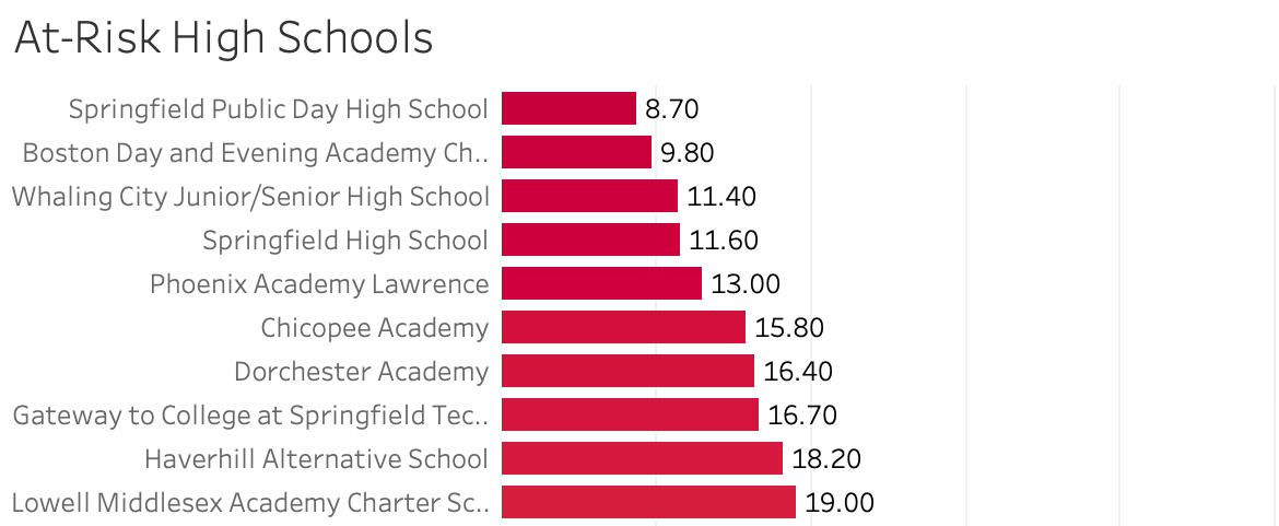
The first bar chart ranks high schools from lowest to highest graduation rate. This visual made it easy to see which schools were struggling the most to help their students graduate, providing a clear target for where additional support might be necessary.
Teachers Teaching Teachers


The second bar chart presents the performance of elementary schools on the 4th Grade MCAS math test. Schools with 50% or more students achieving advanced or proficient scores receive a passing grade, while others are identified as needing improvement. These rankings enable quick identification of schools that require assistance in enhancing their students’ math proficiency and which schools are most equipped to help.
Main Takeaways
The insights from my project revealed several key points:- Larger class sizes show a surprising positive correlation with college attendance rates, suggesting that factors beyond class size play a critical role in student success.
- Identifying struggling high schools is crucial for making informed decisions on where to direct funding and resources.
- Understanding elementary school performance on standardized tests highlights where early intervention could have a significant impact on future success.
This project reinforced my understanding of the powerful role data can play in shaping educational policy. It also posed challenges, particularly in interpreting the unexpected findings about class sizes. I learned to appreciate the complexity within educational data and the importance of considering multiple factors when forming conclusions.I hope my insights spark further conversation on how we can use data to make a positive impact in education. If you are passionate about public education or have experiences to share, I would love to connect! Let’s collaborate on driving improvement in our schools and ensuring every student has access to the education they deserve.

Exploring Hospital Data with SQL
I live in the Ozarks. Healthcare is the largest industry in the region — employing about 17% of the local workforce. And healthcare generates a lot of data, so there’s a good chance my job search could lead me to a role in this field.But I didn't realize just how much data the healthcare industry generates.It's estimated to account for around 30% of the world's data and is growing by a staggering 36% each year.I decided to familiarize myself with hospital data and discover the types of questions I might be asked to answer through analysis. Plus, I saw this as a fantastic opportunity to sharpen my SQL skills, which I believe will be essential for working with this volume of data.
This exploratory analysis showed me how hospital data can reveal key performance indicators and trends that greatly affect healthcare practices and patient outcomes. I learned: - Even a study with a narrow focus can require the collection of large datasets containing a wide variety of information. - Pulling data from multiple sources can add context to the data and help to evaluate things like racial bias in healthcare. - SQL is an excellent tool to draw information from large datasets, but it’s lacking in ways to present that information in a compelling way.Some Key Takeaways: - The majority of hospital stays in the dataset were less than seven days. - There is a clear link between the length of stay and the number of lab tests carried out. - The hospitals in the study appear to be doing well in their efforts to eliminate racial bias when ordering lab tests.
The dataset I used is part of a diabetes study from the UC Irvine Machine Learning Repository.It includes 10 years of patient encounter data from 130 US hospitals. There are over 100,000 encounters involving 71,000 patients who were admitted to the hospital and already had a diagnosis of diabetes, or were given that diagnosis during their stay.The data has been split into two tables for the purposes of this analysis. One table contained details about each medical encounter across 46 columns, while the second held basic patient demographic information with 7 columns.I’m not a diabetes researcher, but the data had enough general information to gain some insights on hospital operations.
I started my analysis by learning how the tables were organized and ensuring the data was clean and usable. With that done, I used SQL to uncover the relationships and patterns I was interested in.
Length of Stay
Length of stay is a critical factor for both hospitals and patients. Hospital capacities, at any given point in time, are fixed. They can build more buildings and hire more staff, but that takes time and money. It’s not something that can be adjusted on the fly. Letting patients stay any longer than necessary uses a resource that might be needed by a more serious patient.Staying in a hospital longer than necessary creates additional costs for the patient too. Even if you’re well insured, a few days in a hospital can add up to an enormous bill.I decided to start my analysis by taking a look at the average time each patient spent in the hospital.


But it didn't give me much of a feel for how the data was distributed. After a bit of searching I was able to find a way to use SQL to display this information as a histogram.


It’s not a presentation-ready result, but it clearly shows the distribution of days each patient was in the hospital during their stay, with the majority being 7 days or less.It would have been interesting to see how these numbers changed over the 10 years covered by the dataset, but that information wasn’t available.
The Connection Between Lab Tests and Length of Stay
Lab tests can be a great diagnostic tool, but they can also be expensive. So I decided to see if there was any link between the number of lab tests and length of stay to see how that might contribute to the overall costs of a visit.

You may have noticed that I used the CAST function several times. The original data type of all the columns in this database is a general format know as VARCHAR. As long as they're less then 100, you can use these values in mathematical operations without any problems. But I knew that some encounters required as many as 132 tests. So I decided to CAST the data as a numerical data type known as FLOATs to make sure the results were accurate.I also knew the results would be difficult to read without some sort of aggregation. So I decide to use CASE WHEN to group the quantity of tests into the categories of “few”, “average”, and “many”.

As you can see, there’s definitely a connection. Finding ways to effectively shorten length of stay should also reduce the number of lab tests ordered as well as costs for the hospital and patients.
Specialist Medical Procedures
Lab tests are expensive, but in my research I learned that medical procedures are the biggest expense for hospitals and patients.I’ve already found a connection between the number of lab procedures and the length of stay, so I decided to take a look at which medical specialties were performing the highest number of medical procedures.My initial query revealed a total of 73 specialties. Some specialties attended to a single patient, while others cared for thousands. Some never performed a single procedure, while others averaged as many as 4 procedures per patient.I decided to include some conditions in my query to identify the 10 specialties who performed a higher than average number of procedures on a significant number of patients.
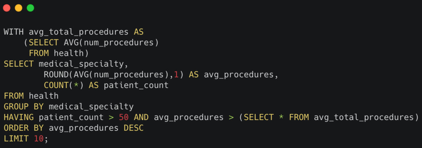
I limited my search to specialties with more than 50 patients and used a Common Table Expression to extract the average number of total procedures so I could compare it to average performed by each specialty.
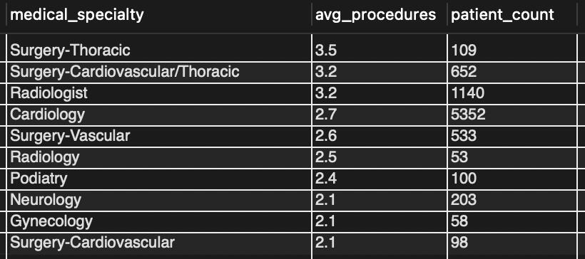
The result is a listing of the top 10 specialties who are the biggest drivers of cost in the hospital.
Evaluating Racial Bias
Since this dataset was originally collected to study diabetes treatment, I decided to learn a little more about the disease.According to the CDC, diabetes already affects more than 37 million adults in the US. That number is expected to grow to more than 54 million by 2030.I also learned that African Americans are 63% more likely to be affected by diabetes than non-Hispanic Whites. And the leading determinant of health is exposure to discrimination.I wondered if I could find any evidence of racial bias in the treatment of patients in this dataset.

I decided to use the number of lab tests performed as a proxy for equality of treatment. Since the study focused only on patients with diabetes, I didn't have account for diagnosis (or lack thereof) as something that might skew the results.Each patient’s demographics were separated into a separate table from their encounter details, so I needed to JOIN the tables using patient_nbr as a key.
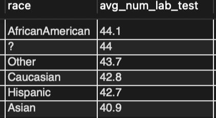
The results are encouraging. This initial query showed no glaring difference in the number of lab procedures performed for any race.
Identifying Research Subjects
With such a large difference in the rates of diagnosis for African Americans, there’s serious demand for treatments targeted for these patients. And some studies have indicated that metformin might be particularly beneficial to African Americans. If this is the case, the researchers in this study might like to compare the outcomes of African American patients to all the patients who received metformin during their stay.I ran one last query to identify all the patients who were either African American OR had received metformin during their stay.
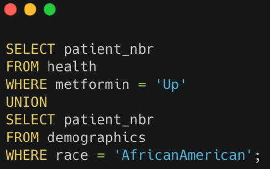
Since all I needed was a list of patient numbers, I used the UNION function to append the results into a single table with 13735 patients who meet the requirements of the study.

Insights
The insights from my analysis reveal important uses for hospital data that can help shape future healthcare practices:
- Reducing Bias: Reducing racial bias is a significant goal for hospitals. By continuing to monitor lab test orders and other procedures, healthcare providers can ensure equitable treatment for all patients.
- Monitoring Procedures: The correlation between the length of stay and the number of lab procedures performed underlines the need for careful management of patients who require extensive care. Monitoring this metric as well as specialties who perform a high number of medical procedures could be used to enhance patient care plans and resource management.
- Shorter Stays: With the majority of hospitalizations lasting fewer than seven days, hospitals can focus on protocols that support quick recovery and discharge practices to optimize bed availability.
Conclusion
Through this project, I learned just how valuable healthcare data can be in making informed decisions for patient care. One of the biggest challenges was finding the right queries to pull the necessary insights from the data, but with persistence and a bit of trial and error, I was able to navigate that successfully.
If you're passionate about health data or work in the healthcare data field, I'd love to connect!Please share your thoughts on these findings or let me know if I can assist in any data roles in your organization.

Rescuing $16 Million:
How Reducing Late Orders Can Lead to E-Commerce Success!
Not too long ago, I found myself knee-deep in e-commerce data, staring at an enormous table of orders, wondering if I could find something useful. It felt a bit like being a detective, sifting through clues to uncover a mystery. The surprise? What started with a simple request to help reduce late shipments led me to discover the potential to save a staggering $16 million in at-risk revenue for a sporting goods retailer.
Why THIS Project?
I was making my way through the interview process with the e-commerce division of a major American sporting goods retailer. In my own business, I had plenty of experience sifting through data, but I was dealing with fewer products and a much smaller customer base. So I wanted to gain practical experience with the large datasets I might encounter at this multi-billion dollar company.When I found a dataset for a global retailer in the same category, I saw a real opportunity to tackle the pressing issues of late shipments and e-commerce profit sources. Every modern business faces these challenges, and I wanted to find some meaningful insights. This project was valuable because it combined my data analysis skills with a real-world problem that could save a company millions.
Key Takeaways:
- Fishing is the most profitable product category for the retailer.
- The U.S. accounts for the most profit but also has the highest late shipment rates.
- A staggering 54% of orders shipped late, totaling $16.2 million in revenue.
- Every 1st Class shipment was late, highlighting a major area for improvement.
Dataset Details:
For this project, I utilized a dataset sourced from Mendeley Data, which included over 180,000 order entries spanning 32 months. Each entry provided detailed information about the item, the order, and the customer. This rich dataset was ideal for uncovering trends and insights, as it offered a comprehensive view of the retailer's shipping operations and their customer’s buying patterns.
Analysis Process:
I began with an exploratory analysis by transforming the data into visualizations using Power BI. Once I had an idea of what was driving profits for the business, I focused on understanding order fulfillment and shipping patterns.One of the biggest surprises was learning that every single 1st Class shipment was delayed. This revelation made me rethink how the retailer could manage its shipping options.
Let's take a look at the performance of the company.
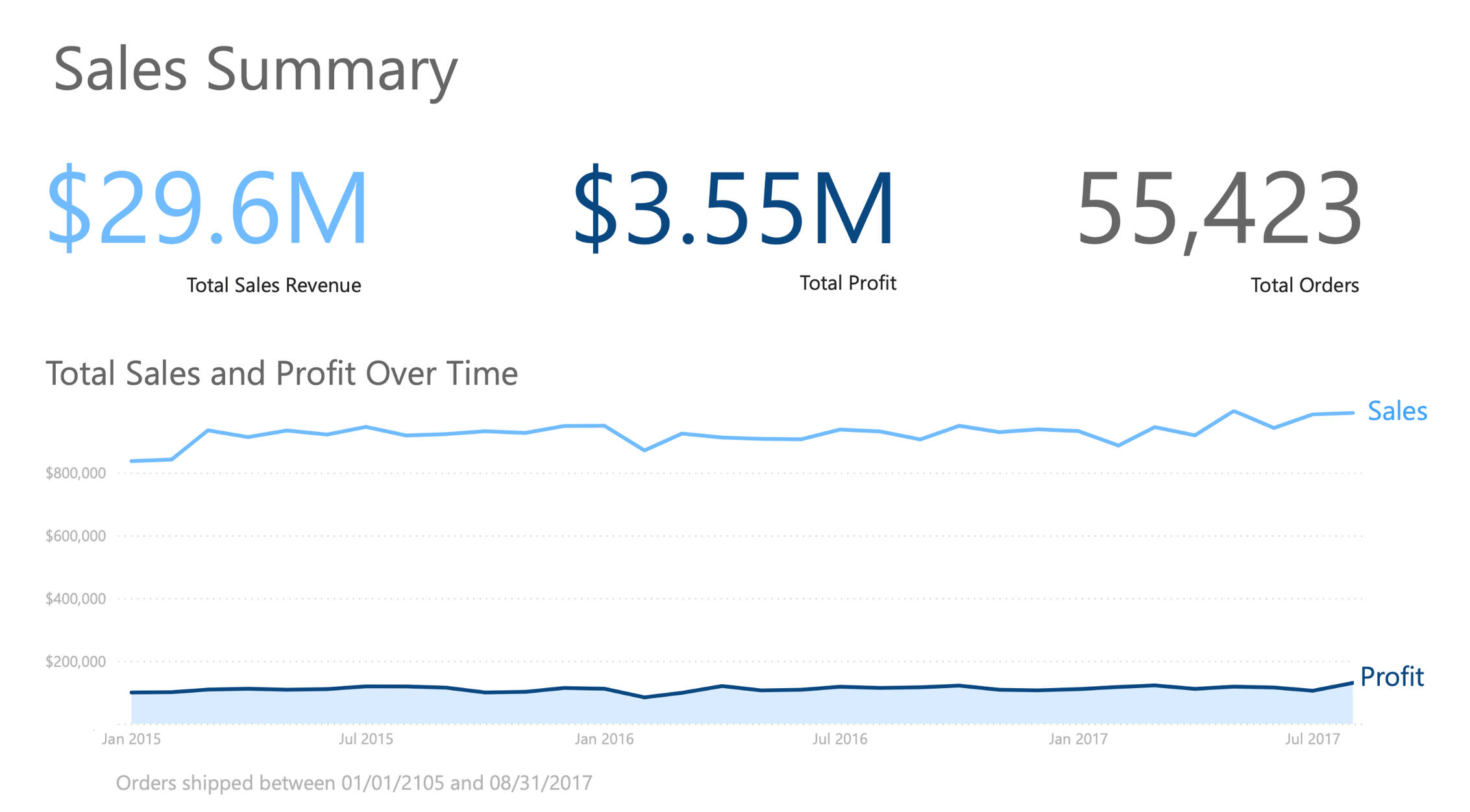
As you can see, the company has grossed nearly $30 million dollars during the 32 months covered by the data.They fulfilled more than 55 thousand orders during this time and they’re maintaining about a 12% margin.
Finding Profit by Segmenting the Data
To discover where the company was making it's profit I decided to segment the data by Customer Type, Product Category, and Country the order was shipped to.

Here, we see that "Consumer" customers contribute to more than half of the profits.
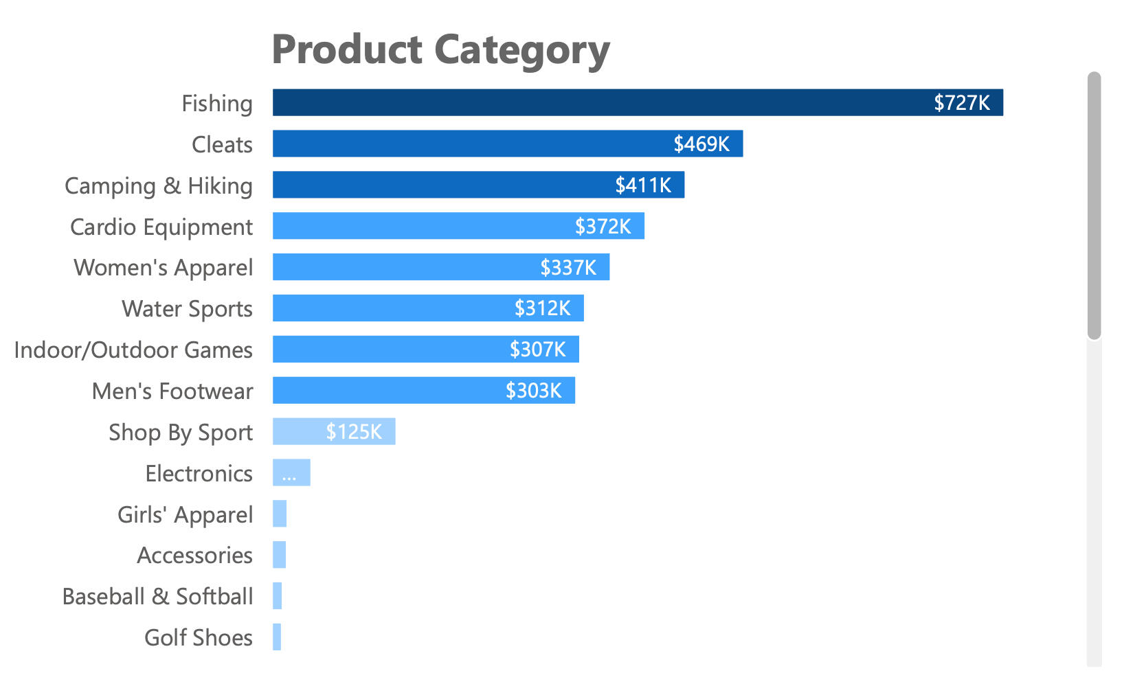
The chart clearly shows that "Fishing" is the most profitable product category, reinforcing the importance of this segment.
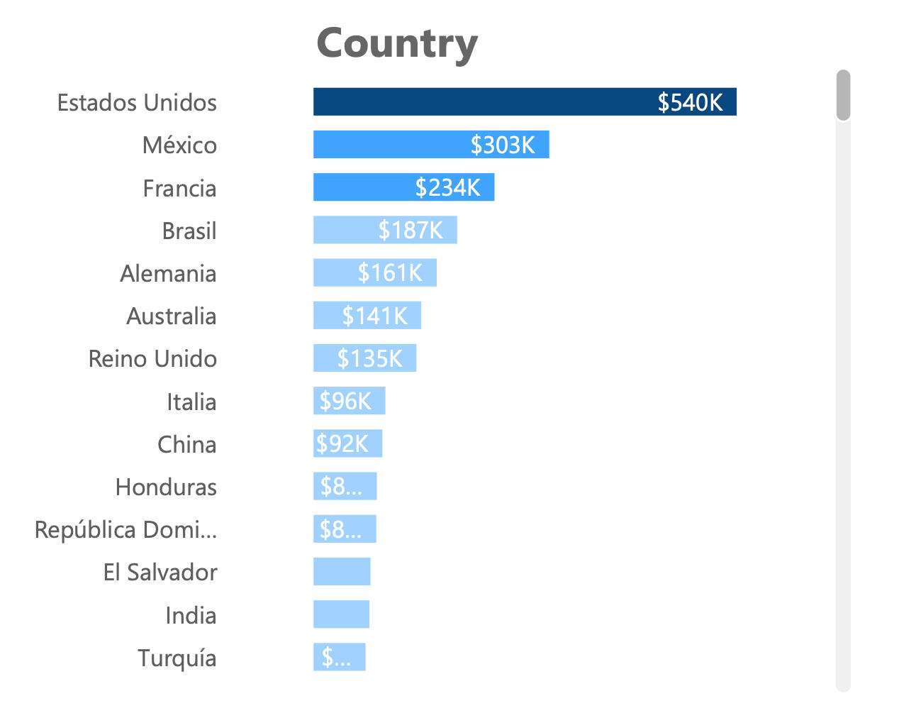
In this chart, we learn the U.S. leads in profits.
As I explored the data, it became obvious that the company was struggling with late order fulfillment.
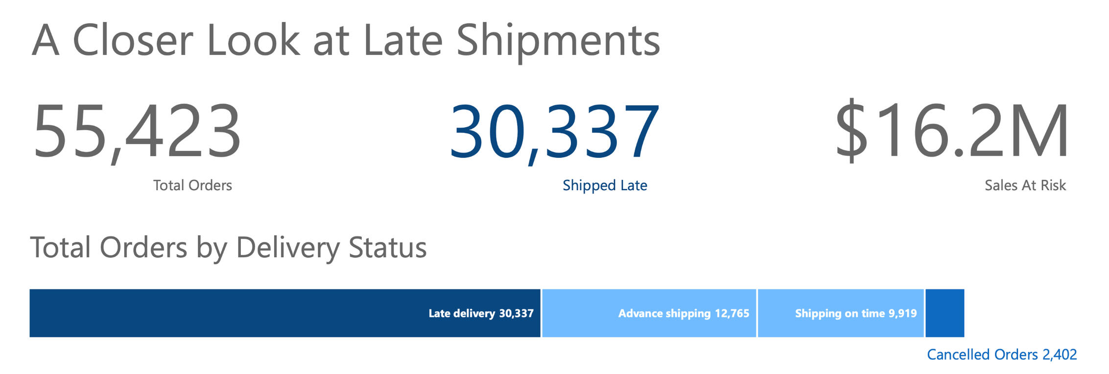
More than half of the company's orders (54%!) shipped late—this is a significant red flag for the business, indicating an area for serious improvement.With so many disappointed customers, they're putting more than $16.2 Million dollars at risk!
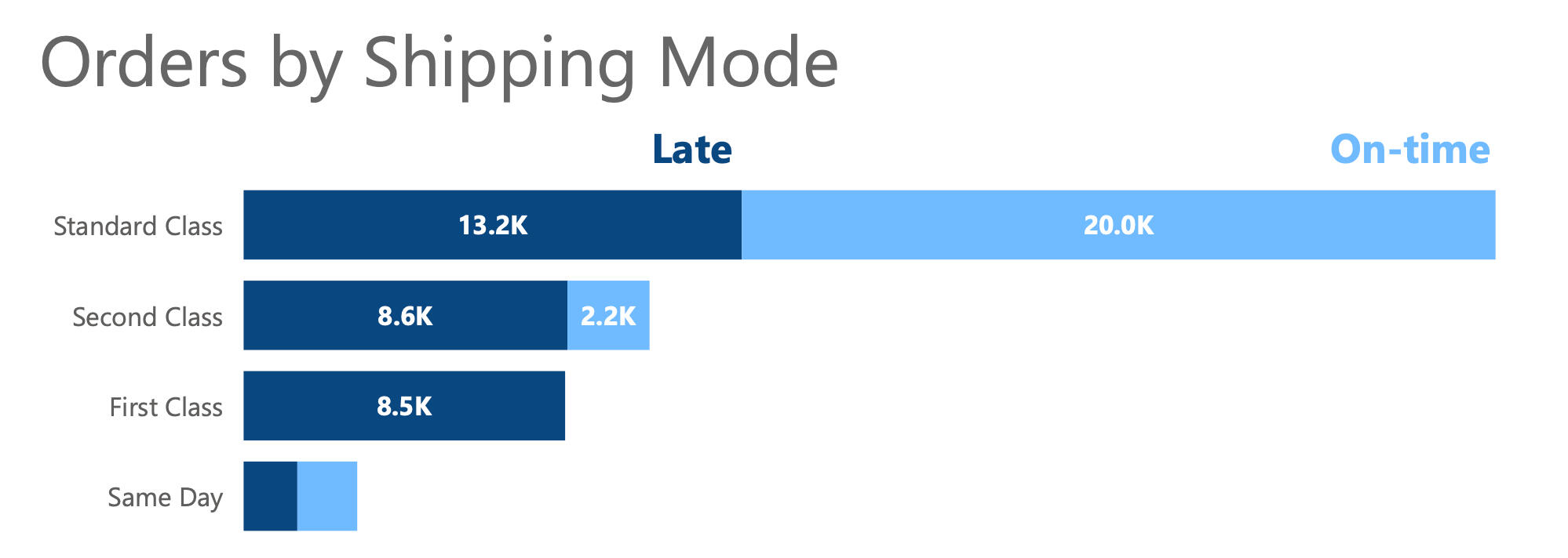
This visual reveals that while Standard Class (4 Day Shipping) orders account for the largest number of late shipments, 1st Class (1-day) shipments are consistently late. This finding presents a clear action item for the retailer.
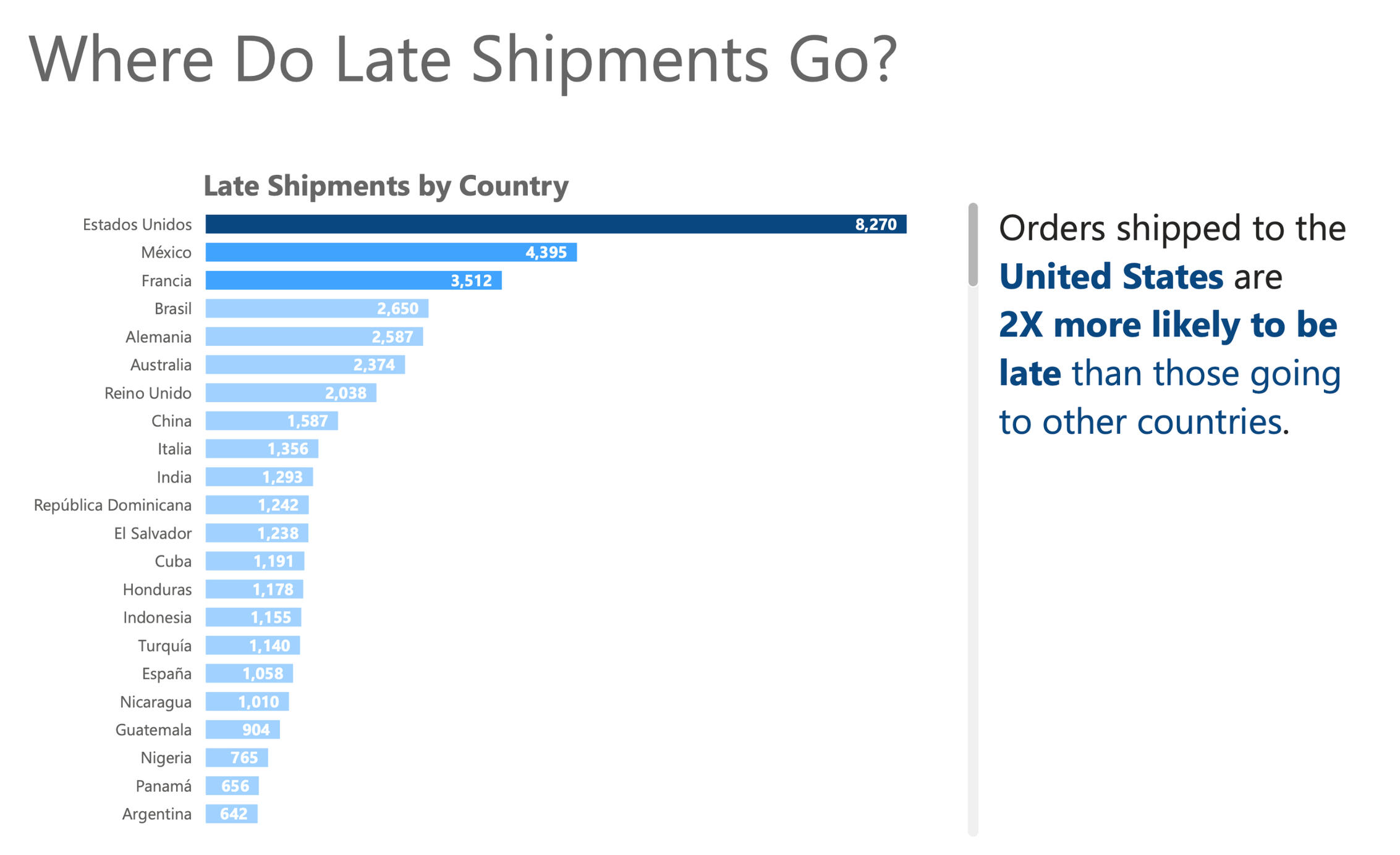
Here we see that U.S. orders are almost two times more likely to be delayed compared to other countries. This suggests where the work of improving fulfillment might begin.
Main Takeaways:
From my analysis, I identified four key recommendations to reduce late shipments:1 - Eliminate 1st Class Shipping (for now): Since every shipment in this category was late by a day, switching customers to 2nd Class could transform their experience from 100% late to 100% on time.2 - Adjust Same Day Shipping Fees: Raising or adding a fee could help shift demand from Same Day to 2nd Class, alleviating pressure on the faster service. A fee adjustment could limit the number of 1st Class customers who decided to upgrade, rather than drop down to 2nd Class shipping.3 - Revisit Early Shipments: Many Standard Class shipments are going out early, which leads to delays in more urgent orders. Prioritizing these could lead to a 34% reduction in late 2nd Class orders.4 - Review Shipping Modes: For low-volume destinations, limiting shipping options could set realistic expectations and reduce customer disappointment.
Conclusion and Personal Reflections:
This project has been an enlightening journey. I learned how crucial timely shipments are for customer satisfaction and revenue. One challenge I faced was the large amount of data, but breaking it down into manageable parts made it easier to find insights. Moving forward, I feel more equipped to tackle real-world e-commerce challenges and contribute to driving efficiencies in logistics and operations.
Lego Set Explorer
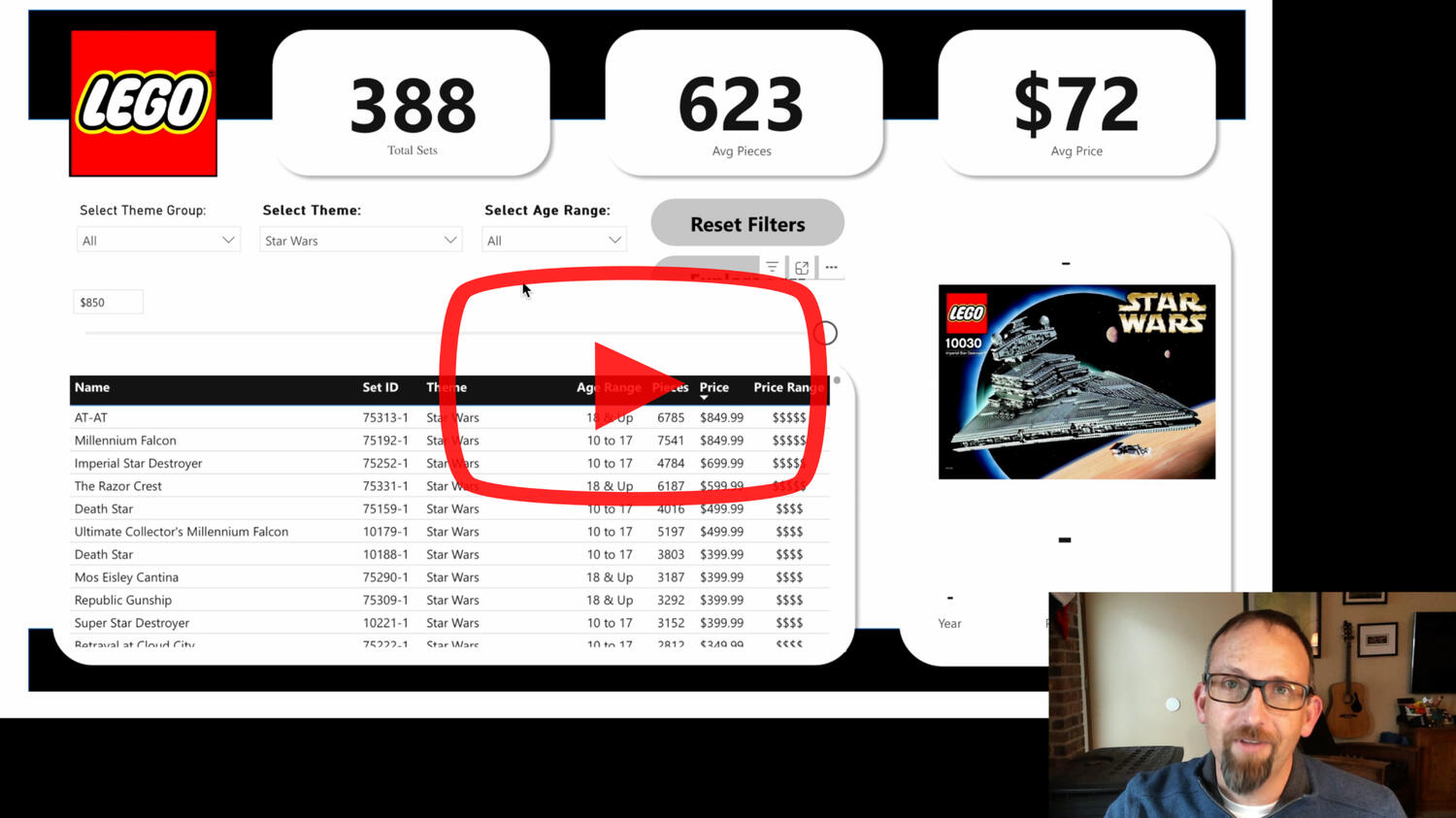
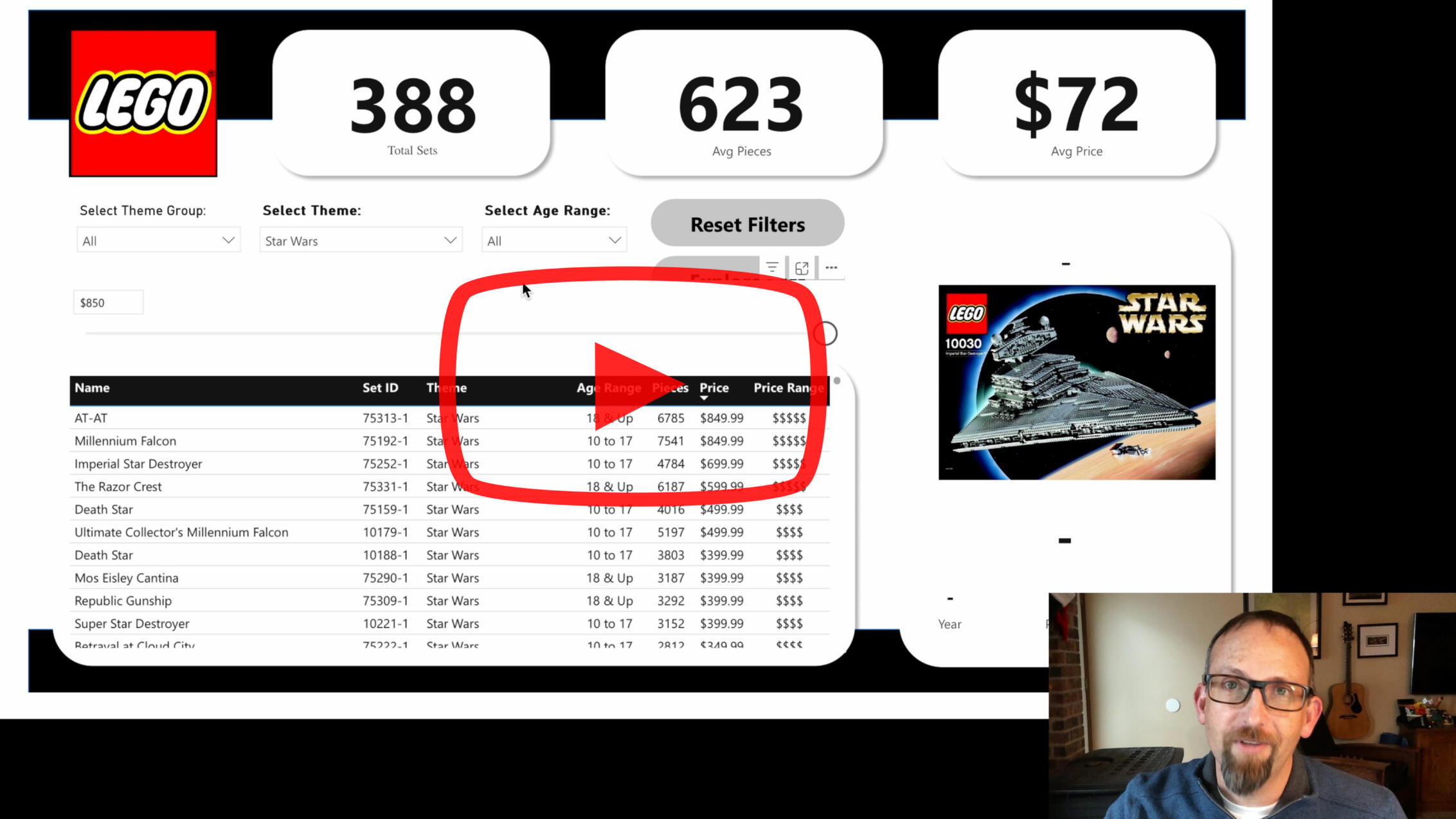
Our family LOVES LEGO!So when I found a dataset filled with piece counts, prices and age ranges, it seemed like the perfect opportunity to build a tool to explore them.Click the image above to watch a YouTube video on how it works.
Good Dads Application Development
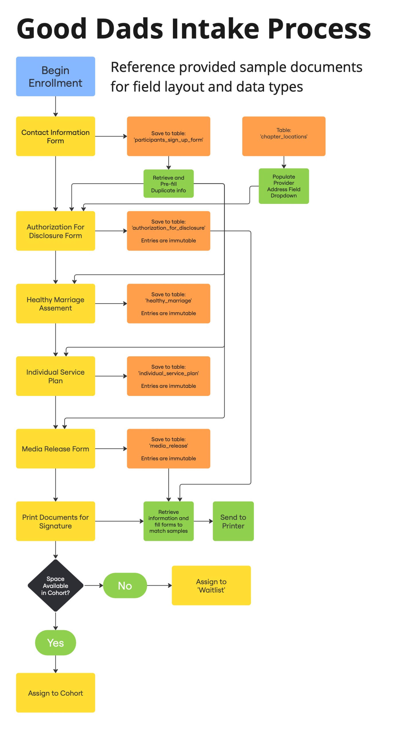
Visual Workflow Design
During my time as a Business Analyst with OpenSGF I've been working to gather requirements from our Stakeholder, Good Dads.As I continue to build a relationship with the Good Dads staff, I collect sample documents and get clarity on feature requests. I sort the information into our system of Project Requirement Documents and create graphics to illustrate the flow of information into and out of our product.I prioritize the information gathered based on the goals of each sprint in our feature-based agile development process.As the project develops, I'll also be developing dashboards and reporting for the use of Good Dads staff, as well as the OpenSGF development team.When our work is done, Good Dads will have a fully digital Participant Management (CRM) and learning management system.
Vitae integer
Phasellus sit amet imperdiet lacus. Fusce nec orci luctus, rhoncus sem at, eleifend massa. Cras auctor, augue et tincidunt tincidunt, tellus justo dignissim dolor, vitae ornare libero.

